
According to the International Association of Scientific, Technical and Medical Publishers (2018), over 3 million scholarly papers are published each year, and that number is rapidly increasing. Researchers must comb through a growing body of scientific work to stay up to date on current research or when performing a literature review.
Text abstracts go a long way toward providing a study summary for this purpose, but they can still require a researcher to take in a large amount of technical information when assessing the relevance of multiple papers at once. Plus, word limits mean abstracts are inevitably condensed and may require highly field-specific terminology, making it difficult to understand the most important aspects of a paper.
This is where graphical abstracts (also sometimes called visual abstracts) come in!
What is a graphical abstract?
A graphical abstract is kind of like a movie poster that gives away the plot. It should draw prospective readers in with attractive graphics. A graphical abstract should be designed in such a way that someone skimming through papers or scrolling through a website or social media feed can understand the basics of what you did and what you found at a glance.
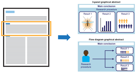
While there’s no standard format for graphical abstracts, the most effective ones often present a clear and concise statement of the main study conclusion—somewhat similar to a short title appearing near the top of the graphic—followed by illustrative representations of the 1-3 most important results and short descriptive phrases where helpful. The content can be organized into different panels and/or connected with arrows as in a flow diagram.
The benefits of graphical abstracts
Humans are visual by nature. We can process the information presented in an image with astonishing speed (Potter et al. 2013)—much quicker than we can process text (Dunn 2022)—and graphics grab our attention.
In the world of social media, posts containing images can boost viewer engagement by over 200% (Li and Xie 2020). The scientific world is no different. Effective graphics can promote interest in research—not only among colleagues within our field but also among nonscientists who may be interested in our work.
In fact, a recent study showed that the use of graphical abstracts in Twitter posts promoting new articles increased paper views by almost 3 times and overall social media engagement by ~8 times (Ibrahim et al. 2017)! With numbers like this, it's easy to see why an increasing number of journals require the submission of a graphical abstract alongside a paper to attract and connect with more readers.

Creating your graphical abstract
Know your audience
Creating a graphical abstract begins with careful consideration of your target audience and what aspects of your paper you want to emphasize given that audience.
For example, your focus may be on other researchers who are likely to read a particular journal and could be interested in reading your paper more in depth. The goal is to provide a compelling graphic highlighting the main findings of the study in the context of an existing gap in knowledge. You want to entice other researchers to read more, cite your work, and maybe even reach out for collaboration.
The use of field-specific terminology, concepts, and imagery along with a focus on the specific findings of your study can work well in this case. On the other hand, if you are instead hoping to reach people who don’t necessarily specialize in your field, you may choose to use more widely recognized terms and imagery and to emphasize the real-world applications of your research over specific results.
Where will a visual abstract be posted?
Another important consideration is where the graphical abstract will be used.
If you are submitting to a journal that requires a graphical abstract upon submission, the publisher is most likely planning to display the graphical abstract alongside the article itself on the journal’s website. Or they could use it to promote the paper on social media.
The journal may list some specific guidelines for the graphical abstract on its website; these are often found in the author instructions for manuscript preparation. Graphical abstract guidelines commonly pertain to aspects such as:
- Image size
- File type
- Font size and style
- Color space to ensure a consistent look of the graphical abstracts across all papers published by the journal and permit successful typesetting
Because the target audience is likely to consist of other researchers in your field, they will often be familiar with field-specific terminology and concepts. But simplification might be worthwhile if you’d like to use your graphical abstract for other purposes with other types of audiences.
Then again, your target journal may not require a graphical abstract at all. In this case, providing a graphical abstract may be optional, or you may want to consider creating one to promote your research on your lab website, on social media, or in presentations at conferences.
While this use offers somewhat more freedom in terms of format, it’s beneficial to consider where you ultimately want to post your graphical abstract. For example, while different social media platforms vary in their recommended aspect ratio for graphics, a 16:9 or 9:16 aspect ratio is often ideal. The jpeg file type is almost universally accepted.
Available applications to create your visual abstract
A wide variety of programs are available to help you create an attractive graphical abstract. Below is a list of commonly used applications and some benefits and drawbacks to each.
Canva
Benefit: Easy to use and can create designs for free.
Drawback: Somewhat limited functionality
Microsoft PowerPoint
Benefit: Almost universally accessible, especially if artwork is downloaded as a pdf file.
Drawback: End result may not look professional, and there can be some incompatibility issues with the software used by journals
Adobe Illustrator
Benefit: Most functionality of all other options, files usually compatible with journal publisher software.
Drawback: Subscription can be costly
Alternatively, if you would like to hand off the design work to professional scientific illustrators, we would be happy to design a graphical abstract for you.
Tips for making a graphical abstract
When creating your graphical abstract, keep in mind that it could be someone’s first impression of your work. Professional presentation is key. You want it to stand out.
Below we list some tips that can help optimize your impact:
1. Consider using icons with a limited color palette and relatively simple illustrations or images.
This will keep clutter at a minimum. Simplicity of design will enhance the clarity of your message and help ensure excess complexity doesn’t cause prospective readers to keep scrolling.
2. Think carefully about the layout.
Aim for an overall balanced look with roughly similar amounts of text and imagery across the design. The content should flow logically from one idea to the next—typically from top to bottom or left to right, although a circular layout might work well if the study has a cyclical element.
Be sure not to use too much or too little white space. The strategic use of white space can improve clarity by providing a visual “break”, but adding too much could result in the ineffective use of space or make the design appear unbalanced.
3. Check the resolution.
Images with low resolution that are highly pixelated will not reproduce well. To avoid this, you can create the illustrations yourself by drawing them in a program such as Adobe Illustrator or taking photos with a digital camera. If these options are not available, however, there are many image sources on the internet.
But be careful! If you are not the original creator of a graphic, it is important to ensure you have copyright permission to use it in your design. Most images on the internet are not free to use, although some free-to-use sites such as Wikimedia Commons and subscription-based repositories such as Shutterstock and Getty Images are available.
It’s always important to double check the licensing (and resolution!) of any image you download from the internet.
4. Optimize your design’s accessibility.
Some ways to optimize accessibility include:
- Ensuring suitable contrast exists between text and its background
- Using appropriately sized sans-serif font
- Verifying that the palette is color blind safe
For example, people with red-green color blindness have difficulty distinguishing the colors red and green. Using these two colors to compare different groups is discouraged. Many tools that help evaluate accessibility are available, including the Proof Setup functions in Adobe products They help you visualize your design under certain types of color blindness.
5. Keep text to a minimum and opt for graphics in its place wherever possible.
The goal is to grab someone’s attention so they want to read more; it’s not necessary to mention every detail in the graphical abstract—that’s what the paper is for!
Final thoughts
An increasing number of journals are requiring graphical abstracts to accompany papers submitted for publication, and you can also use them to your professional advantage. By creating a professional-looking and eye-catching graphical abstract, you can increase your study’s impact by drawing the attention of prospective readers and collaborators and people who might not have otherwise known about your work.
About the author
Kerry Stricker, Ph.D.
Kerry is a Scientific Illustrator and Animator passionate about helping researchers communicate their work visually through graphics and video. Before joining the Research Square Company team in 2016, she received her Ph.D. in Integrative Biology from the University of South Florida and worked as a postdoctoral associate at the University of Florida studying the ecological consequences of plant invasions.
References
Dunn M (2022). Research: Is A Picture Worth 1,000 Words or 60,000 Words in Marketing? https://www.emailaudience.com/research-picture-worth-1000-words-marketing/ (accessed March 15, 2023)
Ibrahim AM, Lillemoe KD, Klingensmith ME, Dimick JB (2017). Visual Abstracts to Disseminate Research on Social Media: A Prospective, Case-control Crossover Study. Annals of Surgery 266(6): e46-e48. DOI: 10.1097/SLA.0000000000002277
International Association of Scientific, Technical and Medical Publishers (2018). STM Report. Prins Willem Alexanderhof 5, The Hague, 2595BE, The Netherlands.
Li Y and Xie Y (2020). Is a Picture Worth a Thousand Words? An Empirical Study of Image Content and Social Media Engagement. Journal of Marketing Research 57(1): 1-19.
Potter MC, Wyble B, Hagmann CE, and McCourt ES (2014). Detecting meaning in RSVP at 13 ms per picture. Attention, Perception, & Psychophysics 76: 270-279.